Almost everything is a time serie
BigQuery Techniques for Robust Time Series Data Handling
tl;dr
Through numerous client engagements involving time series analysis, I’ve observed a recurring pattern in data preparation and forecasting. While the specific applications vary, the fundamental steps are often the same. As most client work is confidential, this deep-dive provides a valuable opportunity to illustrate these techniques with public data.
Introduction
In virtually any data role – be it data engineer, analytics engineer, or data architect – time series data is a constant presence. Despite the vast array of use cases, the fundamental data types we encounter are surprisingly few, and time series is arguably the most prevalent. Think weather, sensor readings, sales, finance, transportation – any metric tracked over time is inherently time series.
And while this arguably will never change, the way we handle it has greatly evolved. Data types remain constant, but tools evolve.
Having transitioned from days of writing PySpark on a large on-prem Hadoop cluster to modern cloud solutions like BigQuery, the difference is transformative. The combination of Python and SQL on BigQuery now handles most of my needs, and BigQuery Studio eliminates the overhead of managing infrastructure like JupyterHub. Auto-save, multiple runtimes, scheduling it all feels like a weight lifted.
And you may start to understand the point of this deep-dive: to explore how to effectively store, process, and forecast time series data in a simple and scalable way, using the tools I’ve come to rely on.
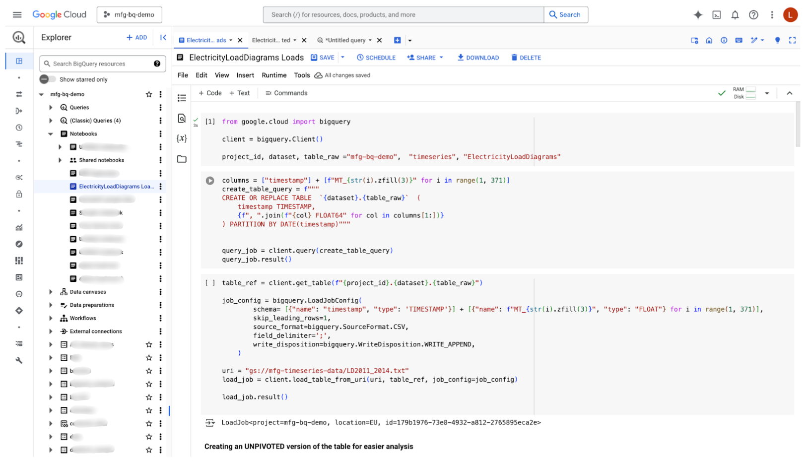
The beautiful interface of BigQuery Studio that will be our playground for today
First, let’s find data
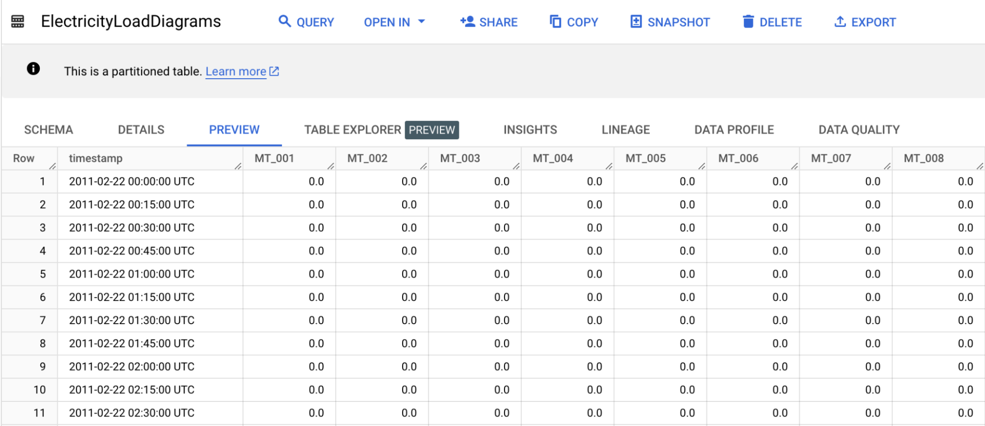
As usual, let’s rely on open data to get a credible example. Let’s change from the traditional sales dataset or stock market datasets, with electricity consumption data from the UCI Machine Learning Repository. It contains electricity consumption data from 370 clients, collected between 2011 and 2014. The data shows electricity consumption for each 15-minute interval, resulting in 96 measurements per day for each client.
The dataset is modest, with only 140k rows and 397MB of data. The CSV file has 371 columns: the first representing timestamps and the other 370 each representing a client. Lucky us, the data is clean : the timestamp is a string with the following format yyyy-mm-dd hh:mm:ss
After downloading the CSV file and uploaded it to a GCS bucket, let’s create a partitioned table in BigQuery (to have a clear conscience if the data volume suddenly ballooned). For the sake of simplicity, I work on a BigQuery Notebook, allowing me to seamlessly run SQL queries and Python code.
from google.cloud import bigquery

client = bigquery.Client()

project_id, dataset, table_raw ="mfg-bq-demo",  "timeseries", "ElectricityLoadDiagrams"

columns = ["timestamp"] + [f"MT_{str(i).zfill(3)}" for i in range(1, 371)]
create_table_query = f"""
CREATE  TABLE IF NOT EXISTS `{dataset}.{table_raw}`  (
   timestamp TIMESTAMP,
   {f", ".join(f"{col} FLOAT64" for col in columns[1:])}
) PARTITION BY DATE(timestamp)"""

query_job = client.query(create_table_query)
query_job.result()
Once the table created, we can upload our CSV file
table_ref = client.get_table(f"{project_id}.{dataset}.{table_raw}")

job_config = bigquery.LoadJobConfig(
       schema= [{"name": "timestamp", "type": 'TIMESTAMP'}] + [{"name": f"MT_{str(i).zfill(3)}", "type": "FLOAT"} for i in range(1, 371)],
       skip_leading_rows=1,
       source_format=bigquery.SourceFormat.CSV,
       field_delimiter=';',
       write_disposition=bigquery.WriteDisposition.WRITE_APPEND,
   )

uri = "gs://mfg-timeseries-data/LD2011_2014.txt"
load_job = client.load_table_from_uri(uri, table_ref, job_config=job_config)

load_job.result()
Everything’s looking good so far but while BigQuery can seamlessly ingest up to 10,000 columns, it would be more handy to have only three columns : timestamp, client_id and measure. In other words, our SQL queries will be easier to write for an unpivoted table - only a crazy mind would accept to work with that many columns. And because the architecture of BigQuery is quite something and Colossus and Borg are hell of good solutions, there is virtually no limit to the number of lines you can ingest.
Let’s first create the table
table_unpivoted = "ElectricityLoadDiagramsUnpivoted"

create_unpivotedtable_query = f"""
CREATE  TABLE IF NOT EXISTS `{dataset}.{table_unpivoted}`  (
   timestamp TIMESTAMP,
   client_id STRING,
   values FLOAT64
) PARTITION BY DATE(timestamp)"""

query_job = client.query(create_unpivotedtable_query)
query_job.result()
And unpivot our initial data
columns = [f"MT_{str(i).zfill(3)}" for i in range(1, 371)]

unpivot_data_query = f"""
INSERT INTO `{dataset}.{table_unpivoted}` (timestamp, client_id, values)
SELECT timestamp, client_id, values FROM timeseries.ElectricityLoadDiagrams
UNPIVOT(values FOR client_id IN {', '.join(columns)})"""

query_job = client.query(unpivot_data_query)
query_job.result()
You can’t always get what you want
We’re fortunate that this open data dataset is remarkably clean, which is uncommon in real life to say the least. Before we discuss unaligned time series, let’s establish two basic checks for time series data: eliminating duplicates and filling gaps. Let’s simulate common data quality issues to make it more representative of real-world scenarios.
So before processing to remove them, let’s introduce duplicates and gaps in our table.
We can introduce both local and global time gaps into our dataset. Local time gaps, specific to individual clients, can be created by randomly deleting rows within the unpivoted data. Conversely, global time gaps, affecting all clients, can be generated by randomly deleting rows from the original, pivoted dataset. To achieve a comprehensive analysis, we will implement both types of time gaps. Because this wouldn’t be fun otherwise, we will do both.
## Manually create global gaps in the table
%%bigquery
DELETE FROM `timeseries.ElectricityLoadDiagrams`
WHERE RAND() < 0.01;
We re-created the ElectricityLoadDiagramsUnpivoted table in order (with the query above) to include the gaps before adding the local gaps :
## Manually create local gaps in the table
%%bigquery
DELETE FROM `timeseries.ElectricityLoadDiagramsUnpivoted`
WHERE RAND() < 0.01;
Final step, let’s add some duplicates
%%bigquery
INSERT INTO `timeseries.ElectricityLoadDiagramsUnpivoted` (timestamp, client_id, values)
SELECT timestamp, client_id, values
FROM `timeseries.ElectricityLoadDiagramsUnpivoted`
WHERE RAND() < 0.2;
Congrats, the data is now bad enough to looks real 🎉
Time for some insights
Of course, before deep-diving, we need to remove the ~20% duplicates we just introduced in our table and to fill the gaps we created.
SELECT
 (COUNT(*) / COUNT(DISTINCT CONCAT(timestamp, client_id)) - 1) * 100 AS row_count_ratio
FROM
 `mfg-bq-demo.timeseries.ElectricityLoadDiagramsUnpivoted`;
In this scenario, the most straightforward approach is to utilize BigQuery’s built-in time series functions and recreate the table. (Materialized views were not an option due to the GAP_FILL function’s current incompatibility with our unpivoted table.) I’ve opted to fill missing values with NULLs, but BigQuery also offers local linear interpolation for more meaningful replacements. Notably, gap-filling isn’t strictly necessary for forecasting, as interpolation will be applied during that stage.
%%bigquery
CREATE OR REPLACE TABLE `timeseries.ElectricityLoadDiagramsUnpivoted`
PARTITION BY DATE(timestamp)
AS
SELECT timestamp, client_id, values
FROM GAP_FILL(
  (
   SELECT timestamp, client_id, values
   FROM (
     SELECT
       timestamp,
       client_id,
       values,
       ROW_NUMBER() OVER (PARTITION BY timestamp, client_id ORDER BY timestamp) AS rn
     FROM
       `timeseries.ElectricityLoadDiagramsUnpivoted`
   )
   WHERE rn = 1
 ),
 ts_column => 'timestamp',
 partitioning_columns => ['client_id'],
 bucket_width => INTERVAL 15 MINUTE,
 value_columns => [
   ('values', 'null')
 ]
);
Now that everything is set, we can finally begin exploring our data 🔎
%%bigquery
SELECT MIN(timestamp) as min_date,  MAX(timestamp) AS max_date FROM timeseries.ElectricityLoadDiagramsUnpivoted
| min_date | max_date | |
|---|---|---|
| 2011-01-01 00:15:00+00:00 | 2015-01-01 00:00:00+00:00 |
%%bigquery
SELECT COUNT(DISTINCT client_id) AS unique_clients FROM timeseries.ElectricityLoadDiagramsUnpivoted
| unique_clients | |
|---|---|
| 0 | 370 |
Not much surprise so far, the provided dataset information is .. on point.
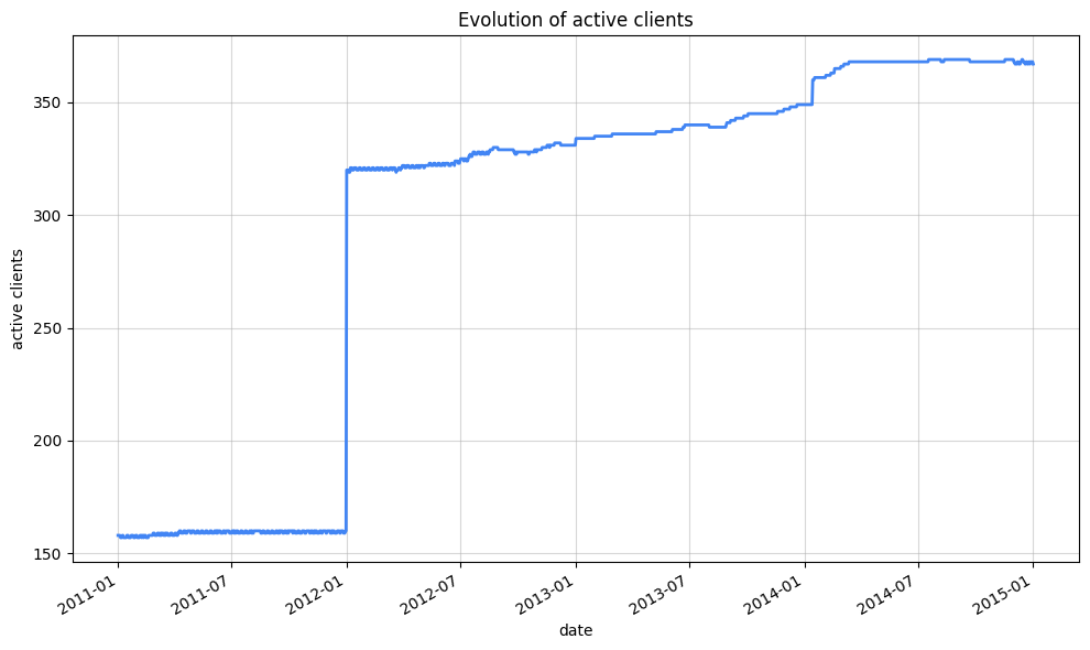
Let’s have a look at the evolution of active clients
%%bigquery
## Evolution of active clients
SELECT
 TIMESTAMP_BUCKET(timestamp, INTERVAL 24 HOUR) AS day,
 client_id,
 COUNTIF(values != 0) > 0 AS is_active
FROM timeseries.ElectricityLoadDiagramsUnpivoted
GROUP BY day, client_id
ORDER BY day
| day | client_id | is_active | |
|---|---|---|---|
| 0 | 2011-01-01 00:00:00+00:00 | MT_225 | True |
| 1 | 2011-01-01 00:00:00+00:00 | MT_215 | True |
| 2 | 2011-01-01 00:00:00+00:00 | MT_059 | False |
| 3 | 2011-01-01 00:00:00+00:00 | MT_218 | True |
| 4 | 2011-01-01 00:00:00+00:00 | MT_032 | False |
| … | … | … | … |
| 540931 | 2015-01-01 00:00:00+00:00 | MT_319 | True |
| 540932 | 2015-01-01 00:00:00+00:00 | MT_167 | True |
| 540933 | 2015-01-01 00:00:00+00:00 | MT_176 | True |
| 540934 | 2015-01-01 00:00:00+00:00 | MT_100 | True |
| 540935 | 2015-01-01 00:00:00+00:00 | MT_011 | True |
540936 rows × 3 columns
As you may have noticed, we can execute both Python code and SQL queries directly within the notebook. We can use IPython magics like %%bigquery to write and run SQL queries seamlessly. These queries can be parameterized, allowing us to load results into variables for later use within the notebook. Let’s demonstrate this by calculating the number of active clients per day.
%%bigquery active_clients_by_day
SELECT
 day,
 COUNT(DISTINCT CASE WHEN is_active THEN client_id END) AS active_clients
FROM
(
 SELECT
   TIMESTAMP_BUCKET(timestamp, INTERVAL 24 HOUR) AS day,
   client_id,
   COUNTIF(values != 0) > 0 AS is_active
 FROM timeseries.ElectricityLoadDiagramsUnpivoted
 GROUP BY day, client_id
)
GROUP by day
ORDER BY day
We can know do our data visualization using `seaborn` as we normally would
import seaborn as sns
import matplotlib.pyplot as plt
import matplotlib.dates as mdates


plt.figure(figsize=(10, 6))
ax = sns.lineplot(data=active_clients_by_day, x="day", y="active_clients", color="#4285F4", linewidth=2)

ax.set_xlabel("date")
ax.set_ylabel("active clients")
ax.set_title("Evolution of active clients")

ax.xaxis.set_major_locator(mdates.AutoDateLocator())
plt.gcf().autofmt_xdate()

plt.grid(True, alpha=0.5)  # Add a subtle grid
plt.tight_layout()  # Adjust layout to prevent labels from overlapping
plt.show()
Another metric that came to mind is the evolution of kwH consumption
%%bigquery kwH_consumption_by_day

SELECT
 TIMESTAMP_BUCKET(timestamp, INTERVAL 24 HOUR) AS day,
 AVG(values/4) AS avg_kWh_load
FROM timeseries.ElectricityLoadDiagramsUnpivoted
WHERE timestamp >= '2012-01-01'
GROUP BY day
ORDER BY day
We will smooth a bit the curve for a better visual result
import seaborn as sns
import matplotlib.pyplot as plt
import matplotlib.dates as mdates


window_size = 10
kwH_consumption_by_day['avg_kWh_load_smooth'] = kwH_consumption_by_day['avg_kWh_load'].rolling(window=window_size, center=True).mean() # center parameter important to avoid shift


plt.figure(figsize=(10, 6))
ax = sns.lineplot(data=kwH_consumption_by_day, x="day", y="avg_kWh_load_smooth", color="#4285F4", linewidth=2)

ax.set_xlabel("date")
ax.set_ylabel("kwH")
ax.set_title("Evolution of kwH consumption")

ax.xaxis.set_major_locator(mdates.AutoDateLocator())
plt.gcf().autofmt_xdate()

plt.grid(True, alpha=0.5)
plt.tight_layout()
plt.show()
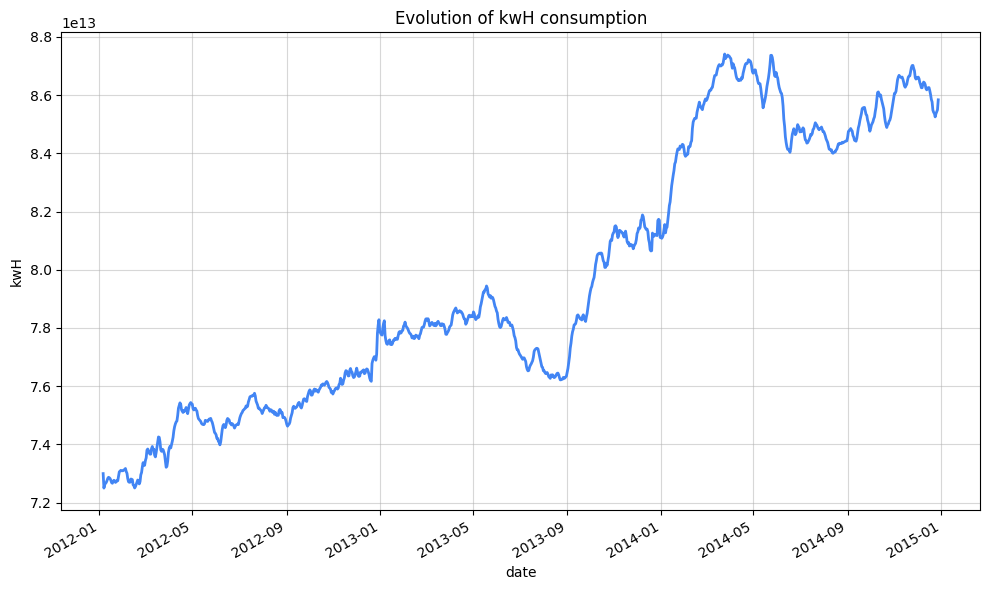
Generally, 8 kWh per day can be considered a moderate energy consumption for an average-sized household (2 to 4 people) in a standard-sized dwelling.
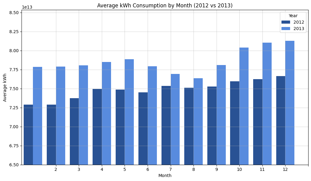
Let’s compare the average kwH consumption by month
%%bigquery average_kWh_consumption_by_month

SELECT
 EXTRACT(YEAR FROM timestamp) as year,
 EXTRACT(MONTH FROM timestamp) as month,
 AVG(values/4) AS avg_kWh_load
FROM timeseries.ElectricityLoadDiagramsUnpivoted
WHERE timestamp >= '2012-01-01'
GROUP BY year, month
HAVING year in (2012, 2013)
ORDER BY year, month
plt.figure(figsize=(10, 6))

ax = sns.barplot(x='month', y='avg_kWh_load', hue='year', data=average_kWh_consumption_by_month, palette=["#174EA6", "#4285F4" ])

ax.set_title('Average kWh Consumption by Month (2012 vs 2013)')
ax.set_xlabel('Month')
ax.set_ylabel('Average kWh')

plt.xticks(range(1, 13))
plt.legend(title='Year')
plt.grid(True, alpha=0.5)
plt.tight_layout()

ax.set_ylim(6.5e+13, None)

plt.show()
%%bigquery monthly_augmentation_percentage
SELECT
month,
ROUND(
 ABS(_2012 - _2013) / ((_2012 + _2013) / 2) * 100
 , 2) as augmentation_percentage
 FROM (
   SELECT
     EXTRACT(YEAR FROM timestamp) as year,
     EXTRACT(MONTH FROM timestamp) as month,
     AVG(values/4) AS avg_kWh_load
   FROM timeseries.ElectricityLoadDiagramsUnpivoted
   WHERE timestamp >= '2012-01-01'
   GROUP BY year, month
   HAVING year in (2012, 2013)
   ORDER BY year, month
 ) PIVOT (AVG(avg_kWh_load) FOR year IN (2012, 2013))
 ORDER BY month
| month | augmentation_percentage | |
|---|---|---|
| 0 | 1 | 6.55 |
| 1 | 2 | 6.66 |
| 2 | 3 | 5.67 |
| 3 | 4 | 4.65 |
| 4 | 5 | 5.20 |
| 5 | 6 | 4.49 |
| 6 | 7 | 2.05 |
| 7 | 8 | 1.66 |
| 8 | 9 | 3.68 |
| 9 | 10 | 5.71 |
| 10 | 11 | 6.12 |
| 11 | 12 | 5.86 |
Switch the data to be unaligned
Before trying to forecast the electricity consumption of various customers, I’d like to digress on one practical aspect of TS data. Most of the time, time series data is unaligned, meaning that data points are not received simultaneously. The logic of what we have seen before is very similar, with TIMESTAMP_BUCKET still applying.
Moving forward, we’ll continue with aligned data, but I wanted to take a moment to show you how to simulate unaligned time series data.
We can transform our table to simulate unaligned data, allowing for a maximum delay of 5 minutes in data arrival.
table_unpivoted_unaligned = "ElectricityLoadDiagramsUnpivotedUnaligned"

create_unaligned_data_query = f"""
CREATE  TABLE IF NOT EXISTS `{dataset}.{table_unpivoted_unaligned}`
PARTITION BY DATE(timestamp)
AS (
 SELECT
   TIMESTAMP_ADD(
     timestamp , INTERVAL CAST(RAND() * 5 * 60 AS INT64) SECOND
   ) AS timestamp,
   client_id,
   values
 FROM {dataset}.{table_unpivoted}
);
"""

query_job = client.query(create_unaligned_data_query)
query_job.result()
A key challenge when working with multiple unaligned time series is the lack of synchronized start and end points, making direct comparison difficult. This is further compounded by differing sampling rates, time zone discrepancies, and the presence of missing or irregularly spaced data, all of which hinder consistent analysis.
However, techniques like TIMESTAMP_BUCKET offer a practical solution for realigning these series, enabling coherent analysis and comparison.
%%bigquery monthly_kwH_consumption

SELECT
 FORMAT_DATE('%Y', timestamp) as year,
 FORMAT_DATE('%B', timestamp) as month,
 AVG(values/4) AS avg_kWh_load
FROM timeseries.ElectricityLoadDiagramsUnpivotedUnaligned
WHERE timestamp >= '2012-01-01' AND timestamp < '2015-01-01'
GROUP BY year, month
ORDER BY year, month
import pandas as pd
import seaborn as sns
import matplotlib.pyplot as plt

month_order = ['January', 'February', 'March', 'April', 'May', 'June', 'July', 'August', 'September', 'October', 'November', 'December']
monthly_kwH_consumption['month'] = pd.Categorical(monthly_kwH_consumption['month'], categories=month_order, ordered=True)

monthly_kwH_consumption_pivot = monthly_kwH_consumption.pivot(index="month", columns="year", values="avg_kWh_load")

sns.heatmap(monthly_kwH_consumption_pivot, fmt="d", cmap="coolwarm")
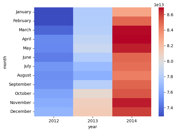
Just a quick note before we move on with forecasting : you might see me using FORMAT_DATE('%B', timestamp) and TIMESTAMP_BUCKET(timestamp, INTERVAL 1 MONTH) for monthly aggregation. While they might visually produce similar results, they function very differently.
FORMAT_DATE creates month names as text, causing alphabetical sorting – which is why we need Pandas’ Categorical to fix the order. TIMESTAMP_BUCKET, on the other hand, generates actual timestamps representing the start of each month. This allows BigQuery to understand and sort the data chronologically, eliminating the need for manual reordering and ensuring accurate time-based analysis.
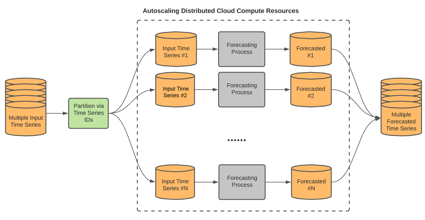
Forecasting the future, 15-minutes at the time
The number one thing one might want to do with time series data is forecasting what is next. In our case, we have enough data to predict the consumption of a given customer. We can achieve this without going far thanks to BigQueryML, it lets you create and run machine learning (ML) models by using SQL queries. Among various models available, the one we’re gonna be interested in today is ARIMA_PLUS.
Because we want to forecast the consumption of each customer, we need to forecast multiple time series. The ARIMA_PLUS model lets us do that thanks to the TIME_SERIES_ID_COL options.
As always with BQML, creating the model is straightforward :
%%bigquery
CREATE MODEL `timeseries.ElectricityForecastConsumption`
OPTIONS(MODEL_TYPE='ARIMA_PLUS',
        time_series_timestamp_col='timestamp',
        time_series_data_col='values',
        time_series_id_col='client_id',
        holiday_region="CA"
        )
AS
SELECT
 timestamp,
 client_id,
 values
FROM
 `timeseries.ElectricityLoadDiagramsUnpivoted`
It processed ~23GB and lasted around 3 hours (as mentioned before, we had to forecast each customers).

BQML automatically replaced the NULLs values we created earlier based on linear interpolation. It also automatically filled the gaps.
At this point, the more curious one can perform an evaluation (only for the best model by default) and inspect the model coefficients :
%%bigquery
SELECT * FROM ML.ARIMA_EVALUATE(MODEL timeseries.ElectricityForecastConsumption);
SELECT * FROM ML.ARIMA_COEFFICIENTS(MODEL timeseries.ElectricityForecastConsumption);
With our model now operational, we can forecast future electricity consumption for each client by specifying the forecast horizon (the number of time points). To forecast the first 10 days of January, the horizon would be 960, given that we have a data point every 15 minutes.
%%bigquery

SELECT *
FROM ML.FORECAST(
 MODEL `timeseries.ElectricityForecastConsumption`,
 STRUCT(960 AS horizon , 0.9 AS confidence_level)
)
Since we didn’t explicitly define the forecast horizon, the model defaults to a maximum of 1000 time points. We could increase this horizon up to 10,000 time points by retraining the model, though this would increase training time. For forecasts exceeding 10,000 time points (approximately 3.5 months in our current hourly data), we can aggregate the data to a coarser granularity, such as hourly, thereby reducing the number of points and allowing us to forecast further, potentially up to 14 months for each client.
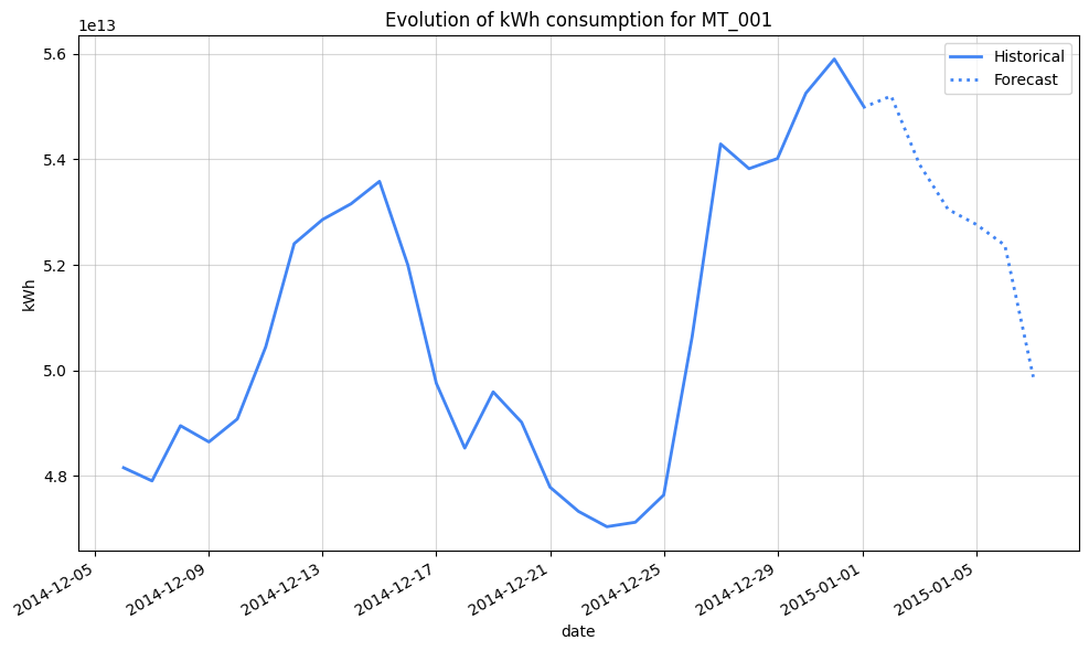
For now, let’s leverage our 15-min model to get a client consumption prediction
%%bigquery ClientConsumptionPrediction
SELECT
   TIMESTAMP_BUCKET(timestamp, INTERVAL 24 HOUR) AS day,
   AVG(values/4) AS avg_kWh_load,
   'Historical' AS data_source,
   null AS lower_bound,
   null AS upper_bound
FROM
   timeseries.ElectricityLoadDiagramsUnpivoted
WHERE
   client_id = 'MT_001' AND timestamp >= '2014-12-01'
GROUP BY day
UNION ALL
SELECT
   TIMESTAMP_BUCKET(forecast_timestamp, INTERVAL 24 HOUR) AS day,
   AVG(forecast_value/4) AS avg_kwh_load,
   'Forecast' AS data_source,
   AVG(prediction_interval_lower_bound/4) AS lower_bound,
   AVG(prediction_interval_upper_bound/4) AS upper_bound
FROM
   ML.FORECAST(
       MODEL `timeseries.ElectricityForecastConsumption`,
       STRUCT(960 AS horizon, 0.9 AS confidence_level)
   )
WHERE
   client_id = 'MT_001'
GROUP BY day
ORDER BY day
import seaborn as sns
import matplotlib.pyplot as plt
import matplotlib.dates as mdates

window_size = 10
ClientConsumptionPrediction['avg_kwh_load_smooth'] = ClientConsumptionPrediction['avg_kWh_load'].rolling(window=window_size, center=True).mean()

plt.figure(figsize=(10, 6))

sns.lineplot(
   data=ClientConsumptionPrediction[ClientConsumptionPrediction['data_source'] == 'Historical'],
   x="day",
   y="avg_kwh_load_smooth",
   color="#4285F4",
   linewidth=2,
   label="Historical"
)

sns.lineplot(
   data=ClientConsumptionPrediction[ClientConsumptionPrediction['data_source'] == 'Forecast'],
   x="day",
   y="avg_kwh_load_smooth",
   color="#4285F4",
   linewidth=2,
   linestyle='dotted',
   label="Forecast"
)


plt.xlabel("date")
plt.ylabel("kWh")
plt.title("Evolution of kWh consumption for MT_001")

plt.gca().xaxis.set_major_locator(mdates.AutoDateLocator())
plt.gcf().autofmt_xdate()

plt.grid(True, alpha=0.5)
plt.tight_layout()
plt.legend()
plt.show()
Let’s compare that on the same period one year before
As mentioned above, it intuitively doesn’t make sense to train the MODEL on 15-minutes intervals if we aggregate the data later on (with the risk to loose precision).
Going further in the future
Let train a larger model on daily-aggregated data
%%bigquery
CREATE MODEL `timeseries.DailyElectricityForecastConsumptionExpanded`
OPTIONS(MODEL_TYPE='ARIMA_PLUS',
        time_series_timestamp_col='day',
        time_series_data_col='avg_kWh_load',
        time_series_id_col='client_id',
        holiday_region="CA",
        horizon=10000
        )
AS
SELECT
 TIMESTAMP_BUCKET(timestamp, INTERVAL 24 HOUR) AS day,
 client_id,
 AVG(values/4) AS avg_kWh_load
FROM
 `timeseries.ElectricityLoadDiagramsUnpivoted`
GROUP BY day, client_id
%%bigquery ClientDailyConsumptionPrediction
SELECT
   TIMESTAMP_BUCKET(timestamp, INTERVAL 24 HOUR) AS day,
   AVG(values/4) AS avg_kWh_load,
   'Historical' AS data_source,
FROM
   timeseries.ElectricityLoadDiagramsUnpivoted
WHERE
   client_id = 'MT_003' AND timestamp >= '2014-12-01'
GROUP BY day
UNION ALL
SELECT
   TIMESTAMP_BUCKET(forecast_timestamp, INTERVAL 24 HOUR) AS day,
   avg(forecast_value) AS avg_kwh_load,
   'Forecast' AS data_source,
FROM
   ML.FORECAST(
       MODEL `timeseries.DailyElectricityForecastConsumptionExpanded`,
       STRUCT(1000 AS horizon, 0.9 AS confidence_level)
   )
WHERE
   client_id = 'MT_003'
GROUP BY day
ORDER BY day
import seaborn as sns
import matplotlib.pyplot as plt
import matplotlib.dates as mdates

window_size = 10
ClientDailyConsumptionPrediction['avg_kwh_load_smooth'] = ClientDailyConsumptionPrediction['avg_kWh_load'].rolling(window=window_size, center=True).mean()

plt.figure(figsize=(10, 6))

sns.lineplot(
   data=ClientDailyConsumptionPrediction[ClientDailyConsumptionPrediction['data_source'] == 'Historical'],
   x="day",
   y="avg_kwh_load_smooth",
   color="#4285F4",
   linewidth=2,
   label="Historical"
)

sns.lineplot(
   data=ClientDailyConsumptionPrediction[ClientDailyConsumptionPrediction['data_source'] == 'Forecast'],
   x="day",
   y="avg_kwh_load_smooth",
   color="#4285F4",
   linewidth=2,
   linestyle='dotted',
   label="Forecast"
)

plt.xlabel("date")
plt.ylabel("kWh")
plt.title("Evolution of kWh consumption for MT_003")

plt.gca().xaxis.set_major_locator(mdates.AutoDateLocator())
plt.gcf().autofmt_xdate()

plt.grid(True, alpha=0.5)
plt.tight_layout()
plt.legend()
plt.show()
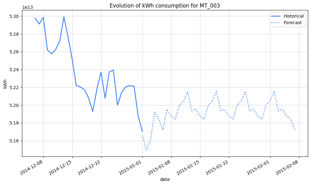
We’ve extended the forecast horizon considerably thanks to the aggregated data, but the persistent pattern starting January 8th, 2015, clearly points to the need for more robust feature engineering.
Merely accounting for holidays isn’t enough to capture the intricacies of this data. To enhance predictive accuracy, we should incorporate lagged consumption (e.g., consumption from the previous day, week, or month) and segment customers based on their usage, building tailored models for each segment.
Conclusion
We’ve covered a lot, so I’ll stop there for this deep dive, but I think you got the idea: BigQuery is really handy when it comes to handling time series data. Preprocessing and forecasting can be efficiently performed within BigQuery using SQL, even at large scales. Although we used batch data for this example, the same approach applies to streaming data.
Think of time series analysis like navigating a vast, intricate map. BigQuery provides the tools – the compass, the magnifying glass, and the telescope – to explore this landscape. We can zoom in to examine individual data points, pan out to observe long-term trends, and even peer into the future with forecasting. And we can do all of this at BigQuery scale, effortlessly handling the vast and ever-expanding territories of time series data.