The times they are a-changing
How TimesFM makes my life easier
tl;dr
BigQuery’s new TimesFM integration allows for powerful, zero-shot time series forecasting with just a few lines of SQL. No model training or management is needed, and it delivers impressive performance out-of-the-box, comparable to that of a trained ARIMA+ model.
Forecasting the future, in a simpler way
Following our previous discussion on managing time series data, there’s exciting news from the forecasting front: BigQueryML now supports the TimesFM foundation model. Announced recently at Next 2025, this development means you can forecast time series without the traditional requirement of training a model.
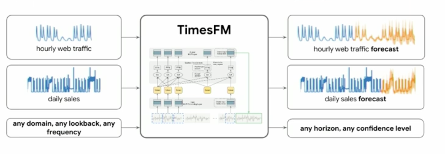
TimesFM, a cutting-edge, pre-trained foundation model from Google Research, is engineered for forecasting tasks. Conceptually, it takes various time series inputs (like hourly web traffic or daily sales, regardless of domain, lookback period, or frequency) and can output forecasts for any horizon with specified confidence levels. The beauty of this is its integration within BigQuery: the model inference runs directly in the BigQuery infrastructure, eliminating the need to train models, manage endpoints, or set up connections. It simply works. Let’s put it to the test!
To see TimesFM in action, we’ll use the same dataset from our previous explorations: the electricity consumption data from the UCI Machine Learning Repository. This dataset tracks electricity consumption for 370 clients between 2011 and 2014, with measurements taken every 15 minutes, resulting in 96 data points per day for each client.
First, let’s prepare and aggregate our data to an hourly level up to a certain point, which will serve as the input for TimesFM.
%%bigquery
SELECT
 TIMESTAMP_BUCKET(timestamp, INTERVAL 1 HOUR) AS hour,
 AVG(values/4) AS avg_kWh_load,
FROM timeseries.ElectricityLoadDiagramsUnpivoted
WHERE timestamp <= "2014-12-15"
GROUP BY hour
ORDER BY hour
We’ll use TimesFM to forecast electricity consumption and then compare these predictions against the actual values for December 2014. While TimesFM can be called on the fly, for repeated analysis, it’s efficient to call it once and store the forecasted values in a table and that’s what we are gonna do.
Here’s how you can generate and store the forecast using AI.FORECAST with TimesFM. Notice the model_name parameter is implicitly TimesFM when not specified and AI.FORECAST is used directly on a table.
%%bigquery
CREATE OR REPLACE TABLE timeseries.ElectricityLoadDiagramsForecasted AS
SELECT *
FROM
 AI.FORECAST(
   (
     SELECT
       TIMESTAMP_BUCKET(timestamp, INTERVAL 1 HOUR) AS hour,
       AVG(values/4) AS avg_kWh_load,
     FROM timeseries.ElectricityLoadDiagramsUnpivoted
     WHERE timestamp <= "2014-12-15"
     GROUP BY hour
   ),
   horizon => 360, -- Number of hourly steps to forecast
   confidence_level => 0.95,
   timestamp_col => 'hour',
   data_col => 'avg_kWh_load');
As promised, no explicit training phase is required ; you can generate predictions with a concise SQL query.
Now, let’s plot the actual electricity load against the load forecasted by TimesFM to observe its performance. We’ll load the forecasted data and the actual data for the comparison period into separate pandas DataFrames.
%%bigquery forecasted_data
SELECT
   forecast_timestamp,
   forecast_value
 FROM
   `mfg-bq-demo.timeseries.ElectricityLoadDiagramsForecasted`
 ORDER BY
   forecast_timestamp
%%bigquery actual_data
 SELECT
   TIMESTAMP_TRUNC(timestamp, HOUR) AS hour, -- Use TIMESTAMP_TRUNC for consistent hourly grouping
   AVG(values / 4) AS avg_kWh_load
 FROM
   `mfg-bq-demo.timeseries.ElectricityLoadDiagramsUnpivoted` -- Corrected table name with project and dataset
 WHERE
   timestamp > "2014-12-10" and timestamp < "2014-12-30"
 GROUP BY
   hour
 ORDER BY
   hour
Next, we merge and prepare the data for visualization:
import pandas as pd
import seaborn as sns
import matplotlib.pyplot as plt

forecasted_data = forecasted_data.rename(columns={'forecast_timestamp': 'timestamp', 'forecast_value': 'forecast_kWh'})
actual_data = actual_data.rename(columns={'hour': 'timestamp', 'avg_kWh_load': 'actual_kWh'})

comparison_df = pd.merge(actual_data, forecasted_data, on='timestamp', how='outer')
comparison_df = comparison_df.sort_values(by='timestamp')

plot_df = comparison_df.melt(id_vars=['timestamp'],
                            value_vars=['actual_kWh', 'forecast_kWh'],
                            var_name='DataType', value_name='kWh_Load')

plot_df = plot_df.dropna(subset=['kWh_Load'])

sns.set_theme(style="whitegrid")

plt.figure(figsize=(16, 8)) # Increased figure size for better readability
lineplot = sns.lineplot(data=plot_df,
                       x='timestamp',
                       y='kWh_Load',
                       hue='DataType',
                       dashes=False,     # Use solid lines for both by default
                       palette={'actual_kWh': '#4285F4', 'forecast_kWh': '#F4B400'})

plt.title('Comparison of Actual vs. Forecasted Electricity Load', fontsize=18, fontweight='bold')
plt.xlabel('Timestamp', fontsize=14)
plt.ylabel('Average kWh Load', fontsize=14)


handles, labels = lineplot.get_legend_handles_labels()
new_labels = ['Actual Load' if label == 'actual_kWh' else 'Forecasted Load' for label in labels]
plt.legend(handles=handles, labels=new_labels, title='Legend', fontsize=12, title_fontsize=13)

plt.grid(True, which='major', linestyle='--', linewidth=0.7)
plt.grid(True, which='minor', linestyle=':', linewidth=0.5, alpha=0.7) # Fainter minor grid
plt.minorticks_on() # Enable minor ticks for more detailed axes

plt.xticks(rotation=45, ha='right') # Rotate x-axis labels for better readability

plt.tight_layout() # Adjust layout to ensure everything fits without overlapping

# Show the plot
plt.show()
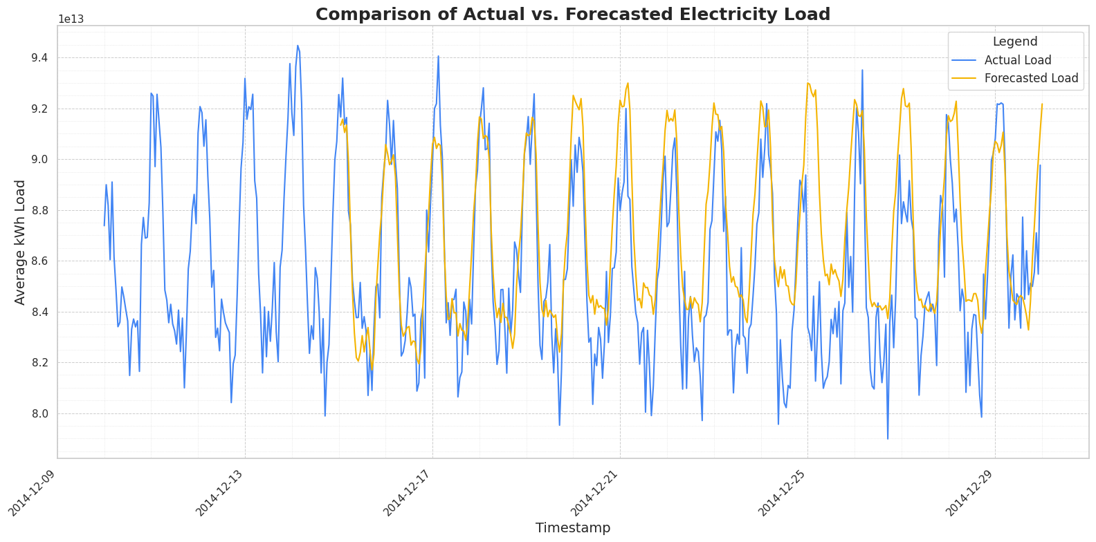
The plot above shows the actual electricity load (in blue) against the load forecasted by TimesFM (in yellow) for the latter half of December 2014. TimesFM does a commendable job of capturing the underlying patterns, including the daily peaks and troughs in consumption. The forecasted load closely follows the contours of the actual load, demonstrating the model’s ability to understand and project the time series dynamics without any specific training on this particular dataset.
But let’s dig deeper. To get a clearer picture of the forecast accuracy, we can calculate and plot the percentage difference between the actual and forecasted load over the same period. This will help us quantify how much the forecast deviates from the actual values.
First, let’s use SQL to compute this percentage difference:
%%bigquery percentage_difference_vs_actual
WITH
 forecasted_data AS (
   SELECT
     forecast_timestamp,
     forecast_value
   FROM
     `mfg-bq-demo.timeseries.ElectricityLoadDiagramsForecasted`
   WHERE
     forecast_timestamp >= TIMESTAMP("2014-12-10") AND forecast_timestamp < TIMESTAMP("2014-12-30")
 ),
 actual_data AS (
   SELECT
     TIMESTAMP_TRUNC(timestamp, HOUR) AS actual_timestamp,
     AVG(values / 4) AS actual_kWh_load
   FROM
     `mfg-bq-demo.timeseries.ElectricityLoadDiagramsUnpivoted`
   WHERE
     timestamp > "2014-12-10" AND timestamp < "2014-12-30"
   GROUP BY
     actual_timestamp
 )
SELECT
 act.actual_timestamp AS timestamp_hour,
 act.actual_kWh_load,
 fc.forecast_value,
 SAFE_DIVIDE((act.actual_kWh_load - fc.forecast_value), act.actual_kWh_load) * 100 AS percentage_difference_vs_actual

FROM
 actual_data act
INNER JOIN
 forecasted_data fc
 ON act.actual_timestamp = fc.forecast_timestamp
ORDER BY
 timestamp_hour;
Now, let’s visualize this percentage difference over time:
plt.figure(figsize=(15, 7))
sns.lineplot(data=percentage_difference_vs_actual, x='timestamp_hour', y='percentage_difference_vs_actual', label='% Difference (Actual vs Forecast)', color='#0F9D58')
plt.axhline(0, color='#DB4437', linestyle='--', linewidth=1, label='Zero Difference') # Line at 0% difference
plt.title('Percentage Difference (Actual - Forecast) / Actual Over Time', fontsize=18, fontweight='bold')
plt.xlabel('Timestamp (Hour)', fontsize=14)
plt.ylabel('Percentage Difference (%)', fontsize=14)
plt.legend(fontsize=12)
plt.xticks(rotation=45)
plt.grid(True, which='major', linestyle='--', linewidth=0.7)
plt.grid(True, which='minor', linestyle=':', linewidth=0.5, alpha=0.7)
plt.minorticks_on()
plt.tight_layout()
plt.show()
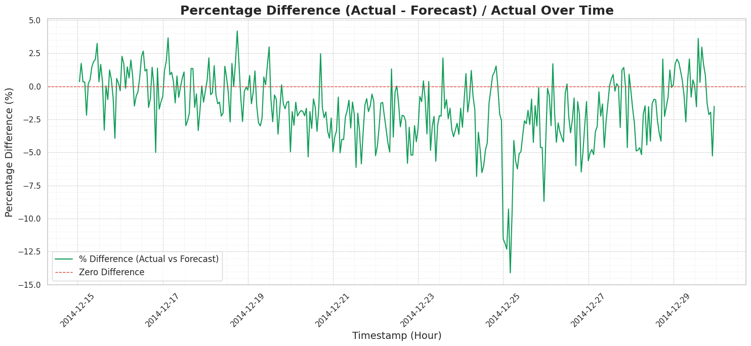
In this plot, the zero difference red line represents something we would all dream of : a perfect forecast. We can observe that the percentage difference (the green line) predominantly fluctuates within a relatively narrow band, mostly between -7.5% and +3%. While there are occasional spikes, the forecast generally stays close to the actual values, indicating a robust performance for a zero-shot model that hasn’t been explicitly trained on this dataset (let’s keep that in mind!).
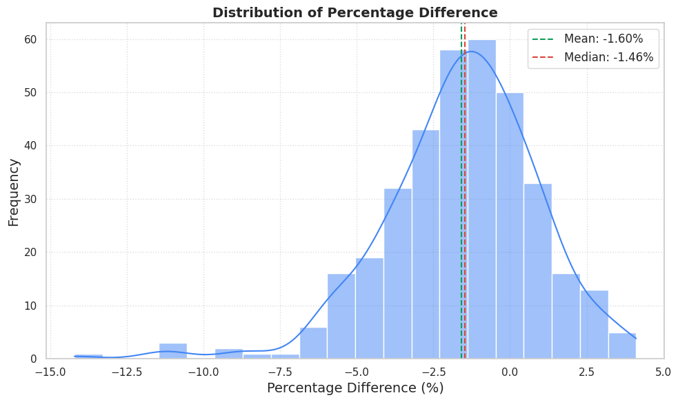
One final visualization to help us appreciate TimesFM’s performance is the distribution of these percentage differences. This will give us a sense of the overall error distribution, highlighting any biases or common error magnitudes. We can easily plot this using the percentage_difference_vs_actual DataFrame we created earlier.
plt.figure(figsize=(10, 6))
sns.histplot(percentage_difference_vs_actual['percentage_difference_vs_actual'].dropna(), kde=True, bins=20, color='#4285F4')
plt.title('Distribution of Percentage Difference', fontsize=14, fontweight='bold')
plt.xlabel('Percentage Difference (%)', fontsize=14)
plt.ylabel('Frequency', fontsize=14)
mean_diff = percentage_difference_vs_actual['percentage_difference_vs_actual'].mean()
median_diff = percentage_difference_vs_actual['percentage_difference_vs_actual'].median()
plt.axvline(mean_diff, color='#0F9D58', linestyle='dashed', linewidth=1.5, label=f'Mean: {mean_diff:.2f}%')
plt.axvline(median_diff, color='#DB4437', linestyle='dashed', linewidth=1.5, label=f'Median: {median_diff:.2f}%')
plt.legend(fontsize=12)
plt.grid(True, linestyle=':', alpha=0.7)
plt.tight_layout()
plt.show()
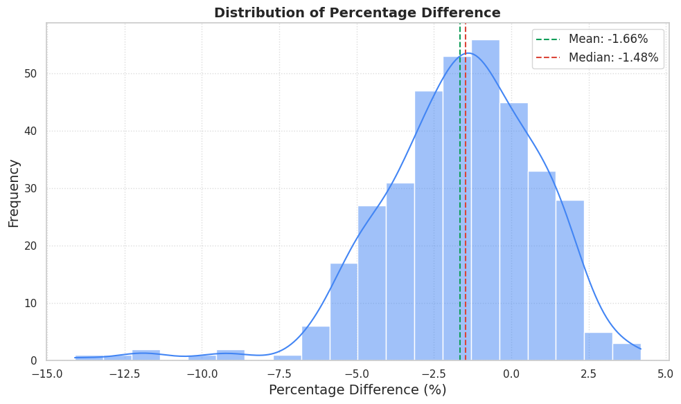
This gives us a good overview of the error distribution : with the mean percentage and the median being respectively -1.66% and -1.48%, this slight negative bias suggests that, for this particular dataset and time period, TimesFM has a minor tendency to over-forecast ( = predict values that are slightly higher than the actuals). However, the key observation is that the majority of the forecasts fall within a tight range around zero, underscoring the model’s general reliability without any fine-tuning.
Let’s test one more thing
An final interesting aspect to explore is the performance difference between the TimesFM zero-shot model and the ARIMA+ model, which we discussed in a previous post. For a fair comparison, let’s quickly retrain the ARIMA+ model on the same historical data, excluding the test period.
%%bigquery
CREATE OR REPLACE MODEL `timeseries.ElectricityForecastConsumptionTFM`
OPTIONS(MODEL_TYPE='ARIMA_PLUS',
       time_series_timestamp_col='hour',
       time_series_data_col='avg_kWh_load',
       holiday_region="CA"
       )
AS
SELECT
 TIMESTAMP_BUCKET(timestamp, INTERVAL 1 HOUR) AS hour,
 AVG(values/4) AS avg_kWh_load,
FROM timeseries.ElectricityLoadDiagramsUnpivoted
WHERE timestamp <= "2014-12-15"
GROUP BY hour
I saved you the visualization code, as it is similar to previous examples but focuses on this specific comparison.
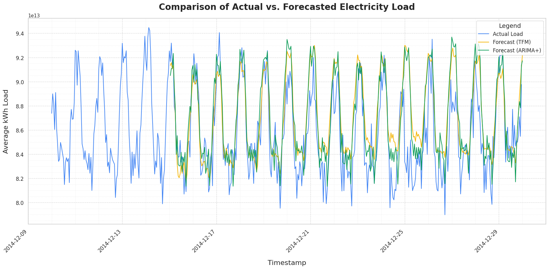
Visually, both models appear to track the actual load closely, effectively capturing the cyclical patterns and fluctuations in electricity demand over the observed period. While ARIMA+ may offer slightly more accuracy for lower prediction values (troughs in demand) in certain instances, TimesFM demonstrates robust performance across the board. It’s particularly noteworthy that TimesFM achieves this without having previously encountered this specific dataset!
Finally, let’s examine the distribution of the percentage difference for the ARIMA+ model.
As previously suspected, ARIMA+ also tends to slightly overestimate the electricity load. However, similar to what we might infer for TimesFM given their comparable overall performance, the relatively tight clustering of the ARIMA+ error distribution around zero indicates that large prediction errors are infrequent.
Overall, TimesFM performs as well as the specifically trained ARIMA+ model on this dataset, remarkably achieving this level of accuracy without requiring any dataset-specific training.
Conclusion
We should rerun these tests on different periods and datasets to get a better idea of TimesFM’s real-world performance, but this gives us a good initial sense of the model’s power. I think we can all agree that the introduction of TimesFM into BigQueryML marks a significant advancement for time series analysis. The capability to generate accurate forecasts using a single SQL query, by leveraging a powerful pre-trained foundation model, fundamentally simplifies what was often a complex and resource-intensive task. There’s no need for manual model training, intricate infrastructure management, or stitching together disparate services. That’s quite a game changer.
Forecasting is changing, and with tools like TimesFM in BigQuery, it’s changing for the better, making sophisticated forecasting more accessible and scalable than ever before. I’m starting to meet teams that make forecasting a default step during data exploration—imagine that what used to be a dedicated, several-month hypothetical project for most companies is now just a part like any other of the day-to-day work of a data scientist.. 🤯